Logo investigation and creation
Logo investigation
Columbia Pictures:
Like many Movie Studio industries, Columbia Pictures has changed its logo many times, reflecting the progress the company has made or the changes in its environment. The Company was founded in 1924, with the original logo featuring a female Roman soldier holding a shield in her left hand and a sheaf of wheat in the right hand. This woman was thought to represent a warrior or goddess, however, the figure in the logo actually represents 'Columbia'
So, who is Columbia??
Columbia is a fictional woman who represents America. Her name derives from Christopher Columbus, and furthermore from the fact that early explorers referred to America as "Columbia."
Essentially, Columbia was the personification of America.
However, the Logo changed to a much softer approach in 1928, featuring 'Columbia' (the female representative of America) wearing a draped flag and holding a torch.
But in 1933, Columbia scrapped the painting for a simple black and white drawing of the torch bearing lady. Over the years, the logo went through many more changes. Some versions featured only the company name. In 1964, the logo was just a drawing of the torch. This was the most simple, stripped-down logo in the company’s history. In 1989, the lady returned, but she remained black and white.
There was even a time when "the torch lady" was seen holding a coca cola bottle instead of its iconic 'torch.' This was because Coca Cola had taken over Columbia Pictures on June 22, 1982.
The lady returns!!
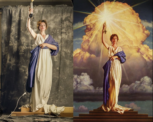
In 1991, the studio decided it needed a new painting of the goddess and Columbia commissioned artist Michael J. Deas to create a new oil painting.
After working alongside Jenny Joseph, his model, during her lunch break, Deas completed the painting after two months! The painting is now an iconic piece of American history, levelling with the statue of liberty.
Overall, the popularity that the painting has gained has greatly increased the brand recognition of "Columbia Pictures" making it a well known and broadly recognised brand. Furthermore, the use of a patriotic symbol as its main feature added to the love of the brand, firstly in America, as the brand resembled with an important piece of American origin.
Dreamworks:
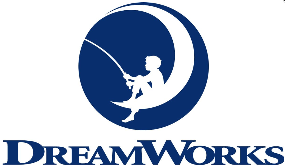
The "Dreamworks" Logo was developed in 1994 when Steven Spielberg, Jeffrey Katzenberg (Former head of Disney), and music producer David Geffen decided that they wanted to start their own animation studio. It was Spielberg himself who came up with the idea of a fishing boy sitting on the moon as he wanted an emblem that would associate with the Golden Age of Hollywood. Although originally wanting the Logo to be created as a CGI (Computer generated image), the logo was hand drawn by who used his son as a model, and Spielberg was later convinced that the logo would look better as a simple painting.
Despite this, in 2007 the logo got its contours cleaned and modernised. Now the image looked truly contemporary and strong. The color palette was also changed and monochrome got replaced by a calm and intense shade of blue, placed on a white background. This new color scheme added a touch of calmness and reliability to the feelings, evoked by the DreamWorks visual identity.
The color palette got elevated in 2016. Blue gained a darker shade, which contrasted with white stronger and brighter. As for the graphical part of the company’s logo, it was also changed — now the image of the boy sitting on the moon is drawn in white and placed in a solid blue background, which has a shape of a circle. The logotype remained almost untouched but got all additional tag lines and elements removed; looking cleaner and more modern.
While the company doesn’t give an official explanation of this choice, we can elaborate on the topic. When a person dreams, she or he in a way becomes more like a child than an adult. Children dream with their horizons unlimited. They don’t know about all these material obstacles that may interfere with their desires. Because of this, nothing is impossible to them. This magical and limitless touch on the imagination is what Dreamworks intends to convey.
When Walt Disney's first silent movie production studio failed, going bankrupt after its first six months in business, he moved back to Los Angeles where he founded the "Disney Brothers Studio" with his brother. From there the studio became "The Walt Disney Studio" in 1926 and has gone from strength to strength since.
In 1955, the company opened its first Disneyland in California and has since opened many more, making the company not just an animation studio, but a conglomerate with different divisions like films, live events, rides and restaurants.
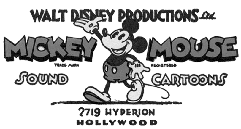
After changing to Walt Disney Studios in 1929, the company made a logo with Mickey Mouse as their mascot. The Disney logo evolution was its prime attraction, and Mickey continues to live between the lines in redesigns of the logo.
The Logo from 1937-1948 was inspired by Walt's love for calligraphy... and added to the element of FUN that Disney wanted to embrace.
However, in 1972-1983 Disney steered away from this handwritten and drawn look and rather embraced a CGI to reflect the companies new capabilities- as they had by now produced two live action films.
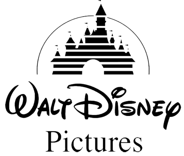
The logo's palace was inspired by the Sleeping Beauty palace at the Disneyland in Anaheim, California. The Palace has become an iconic symbol of the Disney Brand, representing the enchantment and awe that the company hopes to convey through its entertainment.
Overall, the Disney Logo meaning is a story of the company's dedication to making family-friendly, high-quality entertainment and the company's long history in the fields of animation and storytelling.
Marvel:
Marvel was originally known as 'Marvel Comics' through its time period where it only produced quality comics involving several of their own superheroes. However, if we go back even further we see that Marvel initially started off as 'Timely Comics' in 1939 which later became 'Atlas Comics' before solidifying itself as 'Marvel Comics.'
The first Marvel Comics Logo was unveiled through 1957 as a rebranding effort and stayed the same for many years before simplifying the brand even further to just "Marvel" in 2002 where the logo was adjusted to feature just the font type 'Marvel.' This made the logo much more harmonious and sophisticated.
This sophisticated and strong Logo is representative of the superiority superheroes have and the supernatural strength and abilities that they contain. This title is boldly displayed at the beginning of every Marvel film, making a bold statement through its large display and capital lettered font. Immediately it builds up an excitement as it predicts that the movie will be thrilling and big just as its title.
Metro-Goldwyn-Mayer:
The first Logo featuring a lion was introduced in 1916 by publicist Howard Dietz, as he was MGM's ad executive at the time. The Lion was chosen as a tribute to his alma matter Columbia University, whose mascot is a lion.
Many lions have since been used for the logo, the first, named Slats, not actually roaring but preferring to "people watch" instead. However, the lion did give its first audible roar on July 31, 1928 for the debut of the movie "White Shadows in the South Seas." The names of the other Lions used include Jackie, Tanner, the "unknown lion," and Leo.
-Slats- the first lion used
-Jackie- the second lion used
Jackie’s roar was recorded for use at the beginning of MGM talking movies. A sound stage was built around his cage to make the recording. In addition to appearing in the MGM logo, Jackie appeared in more than one hundred films (all black and white films from 1928-1956)
Overall the nature of the logo stood out from anything else seen before. The use of such a wild and potentially dangerous animal in a time where not much development in technology and animal behavior's existed was a tremendous breakthrough and added a sense of empowerment to mankind as it became clear that they are capable of much more than they thought.
Leo is the lion currently present in the logo and has been since 1958.
--OUR LOGO--
STYLE:
- When creating the Logo graphic itself I wanted something that looks elegant and professional so that, when seen, our brand gives the impression that it is of high quality and highly esteemed.
- I created this professional look through the use of only two colours, GOLD and BLACK, keeping it simple and elegant.
- As the name is very long I didn't want to the focus of the Logo to be the name and so I rather made the focus the abbreviation of 'Sensational Studios,' 'SS.' This brand image will therefore be more easily recognised by our target audience as it is short but effective.


Comments
Post a Comment